AQUALABEL
RENEWAL
Elevating your everyday with luxurious packaging
PRODUCT/PACKAGE DESIGN
What if we could treat our customers to a daily spa experience? That’s what AQUALABEL imagined with their all-in-one skincare product, designed to enhance the skincare experience for those who “usually tend to deprioritize themselves but want to use skincare as a time to recharge.”
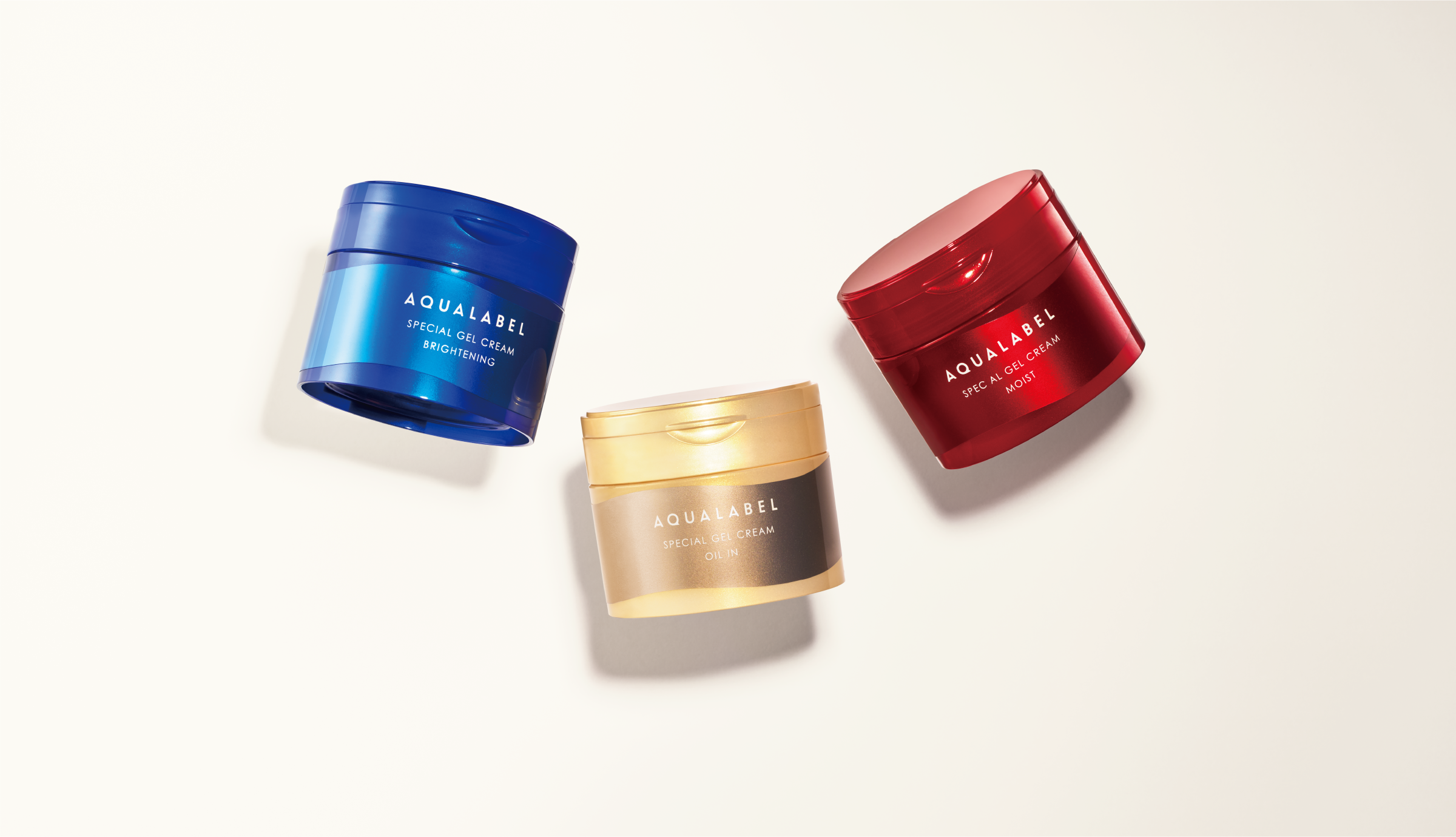
While the packaging design retains the brand’s established red, blue, and yellow gold color scheme, we refined each color for a more luxurious and high-quality feel. Our evolved design transforms even a short skincare experience into a special one.
Developing new visual guidelines
We created a visually pleasing curve and expressed the comforting sensory experience—from the relaxing care to the appealing texture. Our visual guidelines imagine what it means to deliver the feeling of indulgence.
In addition, we created icons for each product’s packaging and POP display. A dripping icon with a fresh and glossy texture represents the product’s Penetrating Beauty Amino Acid.
Eye-catching and high-quality packaging
Throughout the design process, we made numerous adjustments to ensure that the product’s curved form and Penetrating Beauty Amino Acid icon would stand out. Additionally, we took special care to ensure the first refill packaging for the all-in-one product was consistent with the product and looked seamless next to it on the shelf. To add to the container’s pleasing appearance, we used transfer foil, creating a deep luster. Ultimately, we aimed to design something people would enjoy looking at daily.
CREDITS
PRODUCT DESIGN
CREATIVE DIRECTOR KANAKO KAWAI(SHISEIDO CREATIVE)
ART DIRECTORR / DESIGNER AYAMI TOKUHISA(SHISEIDO REATIVE)
PHOTOGRAPHER Maki Ootani (SHISEIDO CREATIVE)〈Penetrating Beauty Amino Acid icon〉
©2022 SHISEIDO CREATIVE COMPANY, Limited All Rights Reserved.


