inoui
Release the old and embrace the new:
Minimal, refined packaging for those who live in the present.
PRODUCT/PACKAGE DESIGN
BRANDING
inoui—once a major influence on Shiseido’s brand image and the Japanese makeup scene—is back. Established in 1976, inoui has focused on individual beauty since its birth. And now, in a world where more people are embracing individuality than ever before, inoui is being “reborn.” This time, inoui is delivering a new message to the modern woman: “What you were born with is what makes you beautiful.”
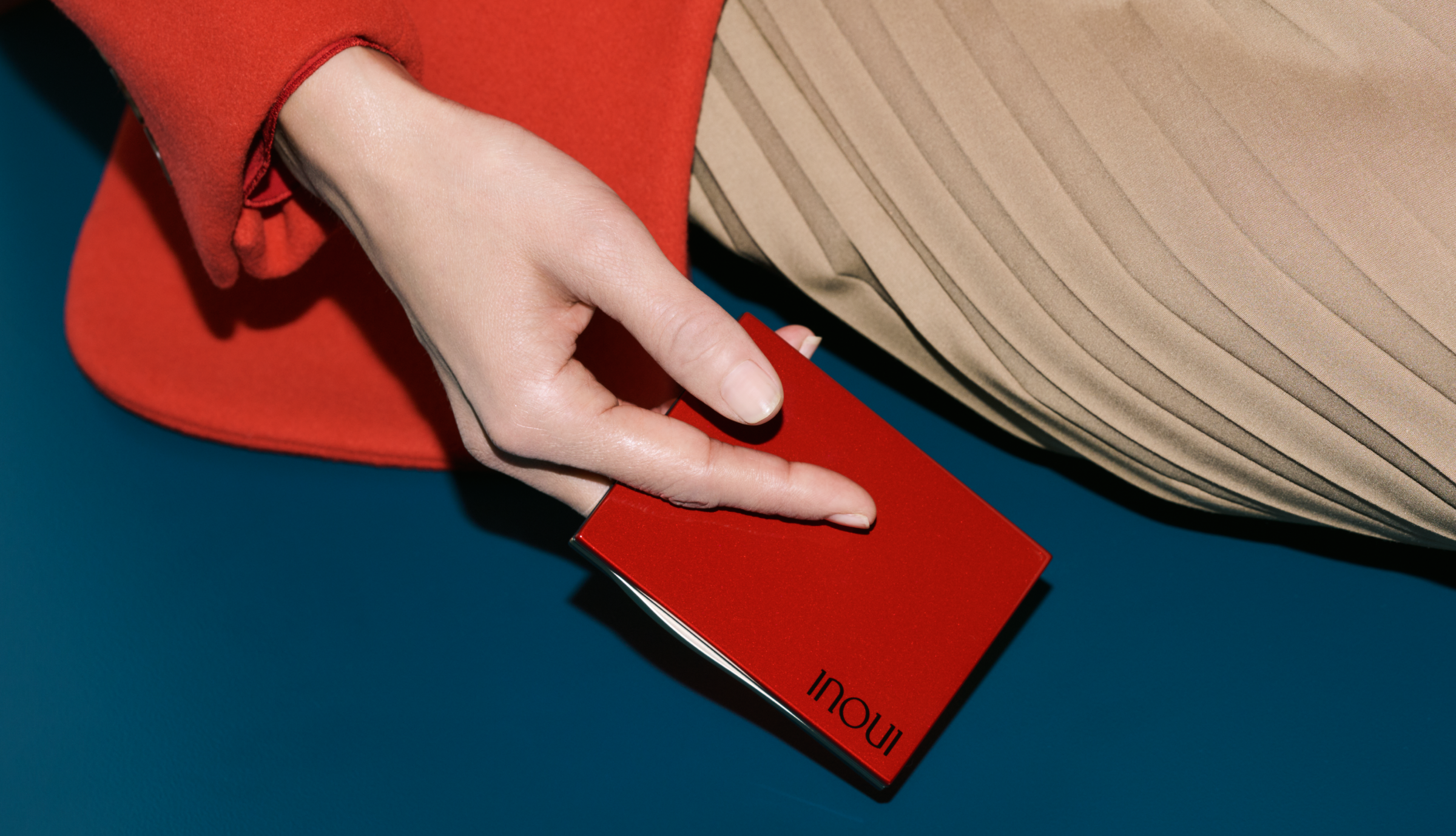
The first chapter of this rebirth? Makeup for the skin and eyebrows that lets women bring out their individual beauty. With minimal but striking silhouettes, the sophisticated packaging adds to the brand’s charm. Meanwhile, the brand color, red, looks different depending on the packaging material. The logo’s typeface draws inspiration from the former logo while still feeling classy, simple, and modern. Both the brand color and logo were central to the rebranding project.
inoui red. A color that’s indescribable.
A color that sparks energy. Inspires action.
Simple, but somehow multifaceted.
inoui red has captured our hearts—and we hope it captures yours, too.
CREDITS
CREATIVE DIRECTOR KAORI NAGATA(SHISEIDO CREATIVE)
ART DIRECTOR YUKA NAGASAKI
DESIGNER SAO OKIDA(SHISEIDO CREATIVE)
PHOTOGRAPHER MASATO KANAZAWA(SHISEIDO CREATIVE)/ MITSUO OKAMOTO
©2022 SHISEIDO CREATIVE COMPANY, Limited All Rights Reserved.


