
SHISEIDO BEAUTY WELLNESS
Integrating design and marketing
through creative direction.
PRODUCT/PACKAGE DESIGN
BRANDING
Shiseido Beauty Wellness (SBW) believes beauty goes beyond the skin or outward appearances. Beauty is also about vitality, health, and the harmony between the skin, body, and mind. As Shiseido’s first-ever expansion into the wellness sector, SBW hopes to help individuals unlock “beauty wellness” in their everyday lives.
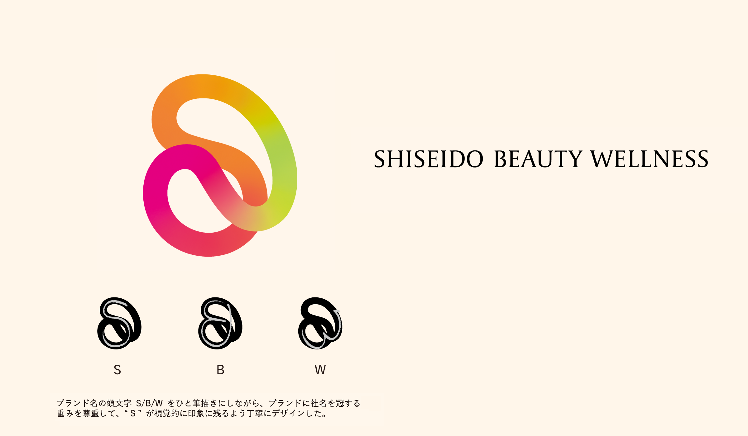

The logo became the “heart” of the brand
The logo represents the connection between the skin, body, and mind by using a single line to form the letters “SBW.” We used prismatic colors to exude positivity—ideal for a brand that helps people grow their beauty. The slender logotype conveys beauty and trust, while its soft, rounded edges and loop-like curves of the “B” and “W” complement the logomark. For the digital space, we created a motion logo. SBW’s logomark is more than just a design; it serves as the “heart” of the brand and is featured on an assortment of branded material, including the press kit and original bags.

Packaging Design
For the VI and packaging design, we assigned a mix of designers with varying skills and aesthetics to the brands and their products. Each product’s packaging features the SBW logomark and logotype, arranged vertically on a white background to create cohesion and complement each product, package, and concept. During the collaborative process with Tsumura and Kagome, we dug deeper into both companies’ roots. By building upon that, we could subtly incorporate the personality of the companies into the designs. Thanks to this process, each product kept its unique character while reflecting each designer’s style. As ingestible products, it was important that our designs put customers at ease.
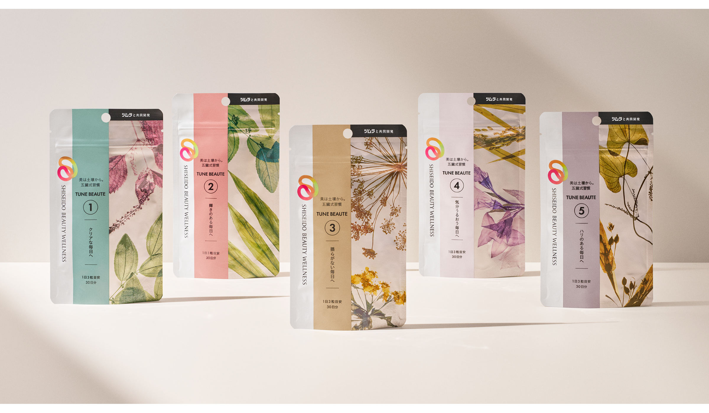
TUNE BEAUTE: The foundation of natural science is the foundation of beauty.
TUNE BEAUTE creates plant-derived products that fuse the Eastern “Five Elements” philosophy and cutting-edge beauty science expertise. Our design centered around the beauty found within plant life’s various shapes and colors. Using color photography, we captured the timeless beauty of botanical specimens. Each of the five products and their functions were represented through different colors and numbers, resulting in a simultaneous sense of unity and variety. Reminiscent of 19th-century natural science blueprints and experimental works by early photographers, our design unites photography, graphic design, and texture.


ROOTINA: The hidden power of fruits and vegetables, “Kagome,” and nature’s blessings.
This twice-daily beauty drink explores the relationship between our biological clocks and beauty by delivering original recipes for the morning and evening. We interpreted the flow of time between morning and night by designing a logo that represents the rotation of the sun and moon. “Kagome” (the woven basket pattern the company is named after) inspired each of our bottle labels, which feature minimal colors to represent the hidden power of carefully harvested fruits and vegetables. The sleeve of the six-pack sold online depicts the expanse of nature where the vegetables grow, morning and night. The design not only conveys the product’s taste and effectiveness but also its origins.


THE COLLAGEN: Depicting the evolution of technology.
With the evolution of The Collagen’s formula, it was essential for the design to emphasize functionality and trust. We updated the logo, focusing particularly on the roundness of the letters. In addition, we created a pattern evoking the image of moist, supple cells and molecules. The products intended for different life stages used varied colors and gradations to convey a high-quality feel.
We designed the bottle labels while considering that some customers may want to be more discreet about the contents of their drinks. For products targeting entry-level collagen consumers, the design features bright colors and real-life scenes to inspire new beauty habits.


CREDITS
BRANDING
CREATIVE DIRECTOR KAORI NAGATA/IPPEI MURATA(SHISEIDO CREATIVE)
DESIGNER SAYOKO KANGAWA/MISAKI NAGATAKE(SHISEIDO CREATIVE)
MOTION LOGO BB Media Inc.
PRODUCT DESIGN
CREATIVE DIRECTOR KAORI NAGATA/IPPEI MURATA(SHISEIDO CREATIVE)
DESIGNER SAYOKO KANGAWA/MISAKI NAGATAKE(SHISEIDO CREATIVE)
PHOTOGRAPHER MAKI OTANI (SHISEIDO CREATIVE)
©2022 SHISEIDO CREATIVE COMPANY, Limited All Rights Reserved.