S/PARK
BRANDING
Visual identity of a research facility open to the public
PRODUCT/PACKAGE DESIGN
SPACE/VMD/WINDOW DESIGN
BRANDING
GRAPHICS
Shiseido Global Innovation Center, a research facility designed to become a Shiseido beauty complex experience facility, opened in April 2019. The facility is called S/PARK. The name "S/PARK" refers to both the "sparking laboratory" where it continuously generates innovations, and "Shiseido's park" where many people gather, as the center will be open not only to researchers but also to the general public. We will introduce the branding design to establish it as a public place.
We developed the design of the initial "S" of S/PARK with inspiration from a part of the kanji character for beauty ("美"). The concept is to create a place where beauty innovation originates in Japan.
Simple English was used as the primary language to create a facility that anyone worldwide can use comfortably and pleasantly. With Kontrapunkt, we made the original fonts and pictograms used.
As with letters, we pursue pictograms that can be understood without discomfort by anyone worldwide.
The same typeface and tone are used throughout the space and in graphic printed materials.
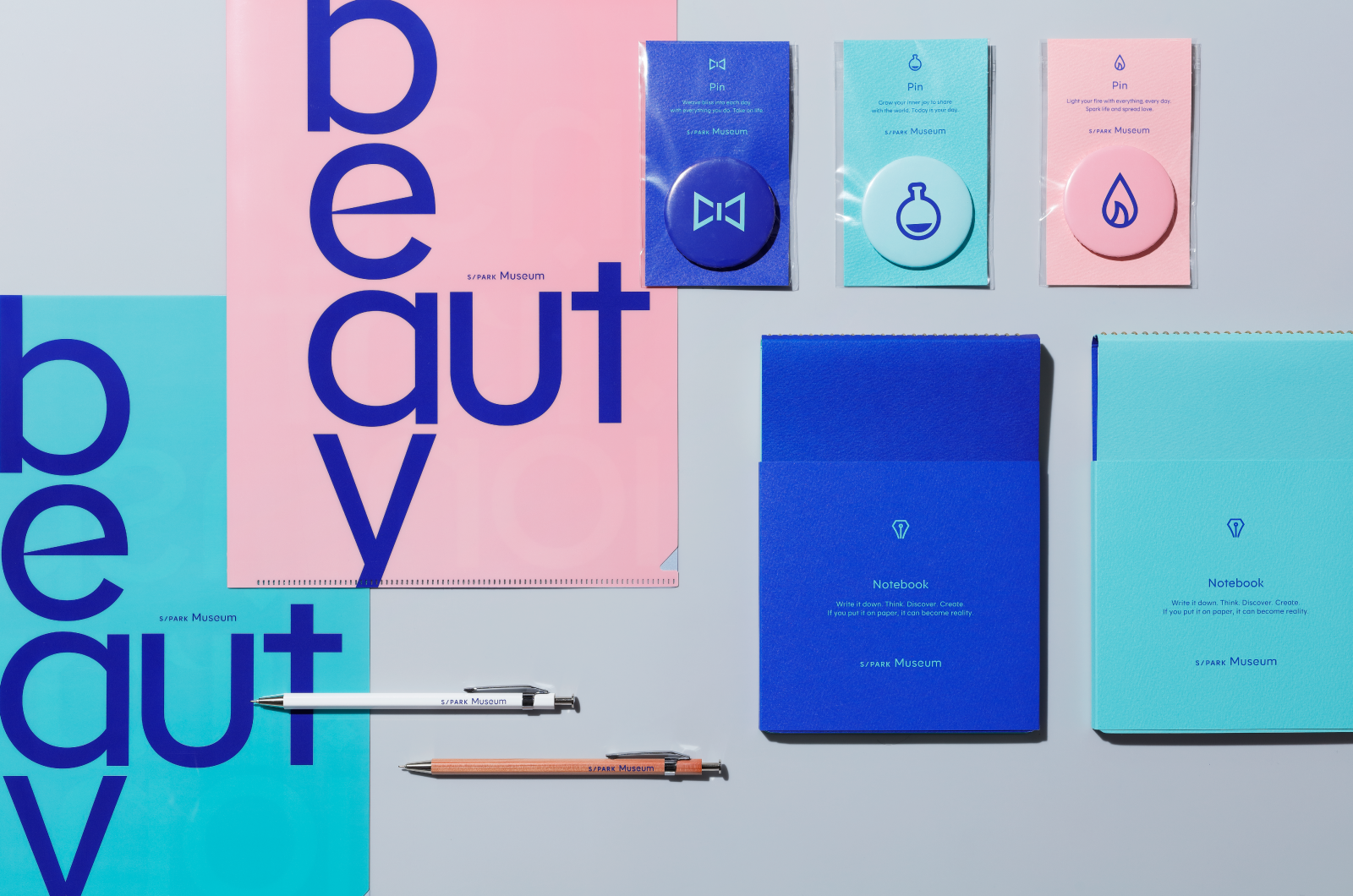
We also designed the menu and goods related to the four contents of S/PARK, café, sports facilities, beauty bar, and interactive museum.
Merchandise sold at the museum and pamphlets distributed when the museum first opened
Adult-oriented goods featuring Shiseido's heritage
CREDITS
EXECUTIVE CREATIVE DIRECTOR Nobuto Yoji (SHISEIDO CREATIVE)
CREATIVE DIRECTOR / ART DIRECTOR Masaki Hanahara
DESIGNER Kazuki Kobayashi
COPYWRITER MIKE BURNSRyohei Nagaiwa
PRODUCER Kentaro Kurauchi
SPACE DESIGN
ART DIRECTOR Momoko Kishino (SHISEIDO CREATIVE)Keisuke Hori (SHISEIDO CREATIVE)
PACKAGE DESIGN
ART DIRECTOR Kaori Kondo (SHISEIDO CREATIVE)Sayoko Kangawa (SHISEIDO CREATIVE)
DESIGNER Ryosuke Kuga
©2022 SHISEIDO CREATIVE COMPANY, Limited All Rights Reserved.


